My favorite Google & Canva fonts
I have a font-buying addiction.
I’m no stranger to Creative Market’s font section. Getting to classify my impulse purchases as business expenses? Dangerous.
Sometimes, though, it’s nice to have a fallback that’s completely free.
If your brand does not have defined font styles and you’re hoping to become a little more consistent, this might be a great place to start.
Here are five of my favorite free typefaces, suggestions for how to use them, and a handy tip for getting your sizing just right.
Plus—They’re all available in both Google and Canva, so you’re ready to start designing without having to download or import anything.
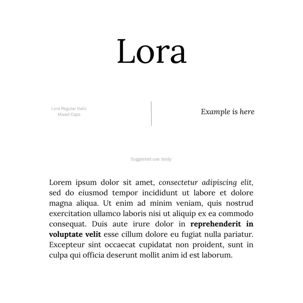
Lora is my go-to for large swaths of body text. It also looks great italicized as a complementary or decorative type over a photograph.
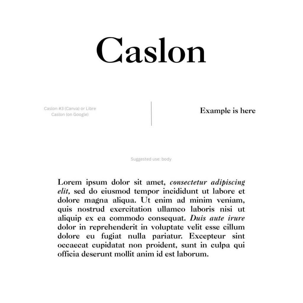
Caslon is an old typeface dating back to the 1700s. There’s a million different versions out there for free—find one you like and run with it.
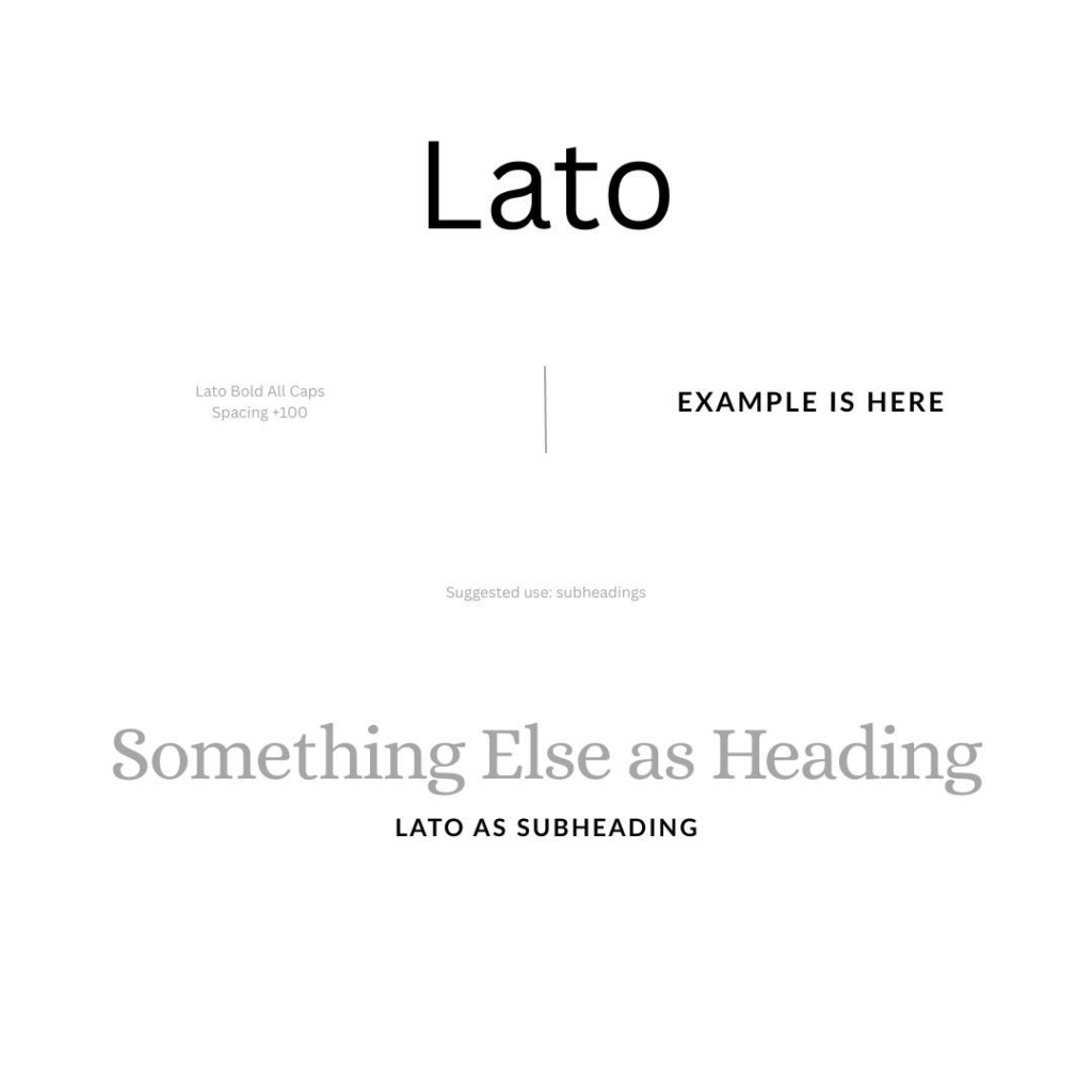
Lato is my favorite for creating clean subheadings that pair nicely with a more classic serif heading. Drag the letter spacing out a bit for that modern look.
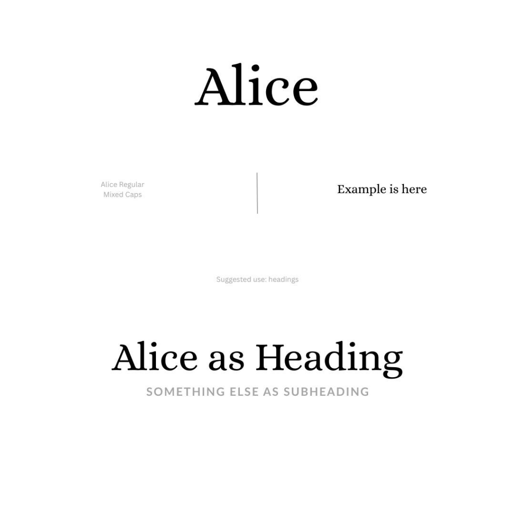
Alice is my personal brand font. I like that the serif has some softness to it without feeling too childish. Alice makes beautiful headings that are easily readable.
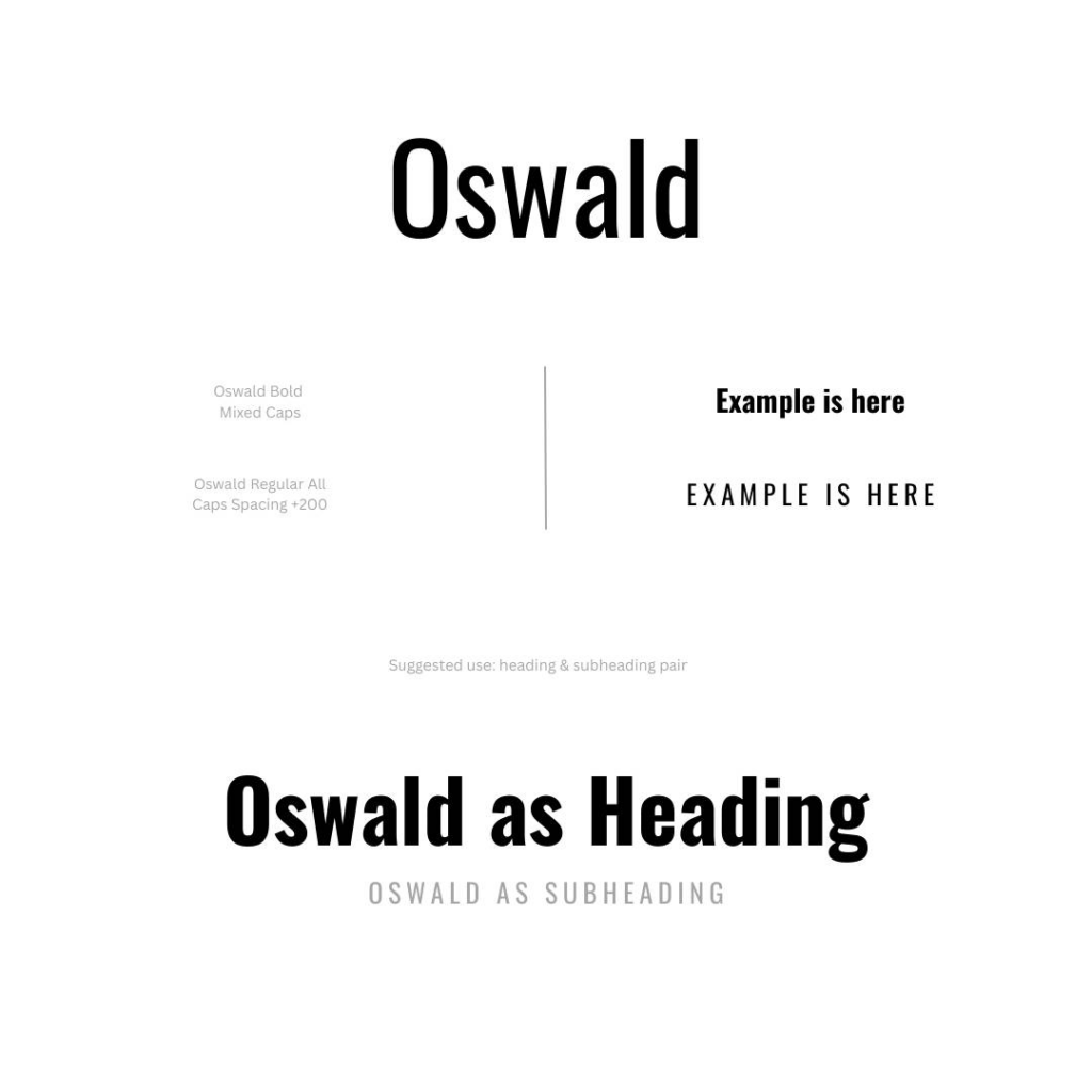
If you’re looking for a super modern combo, consider Oswald for both your headings and subheadings. This is also a great pairing for billboards or other signage that needs to be readable from a distance.
Ok, are you ready for that trick I mentioned?
Have you ever felt like your heading/subheading sizing was just… off? Try this easy trick to get it honed in:
1) Your subheading font height should be 1/3rd of your heading height.
2) Then, when you stack them atop each other, your subheading should be one subheading’s-worth-distance from your heading.
Like so:
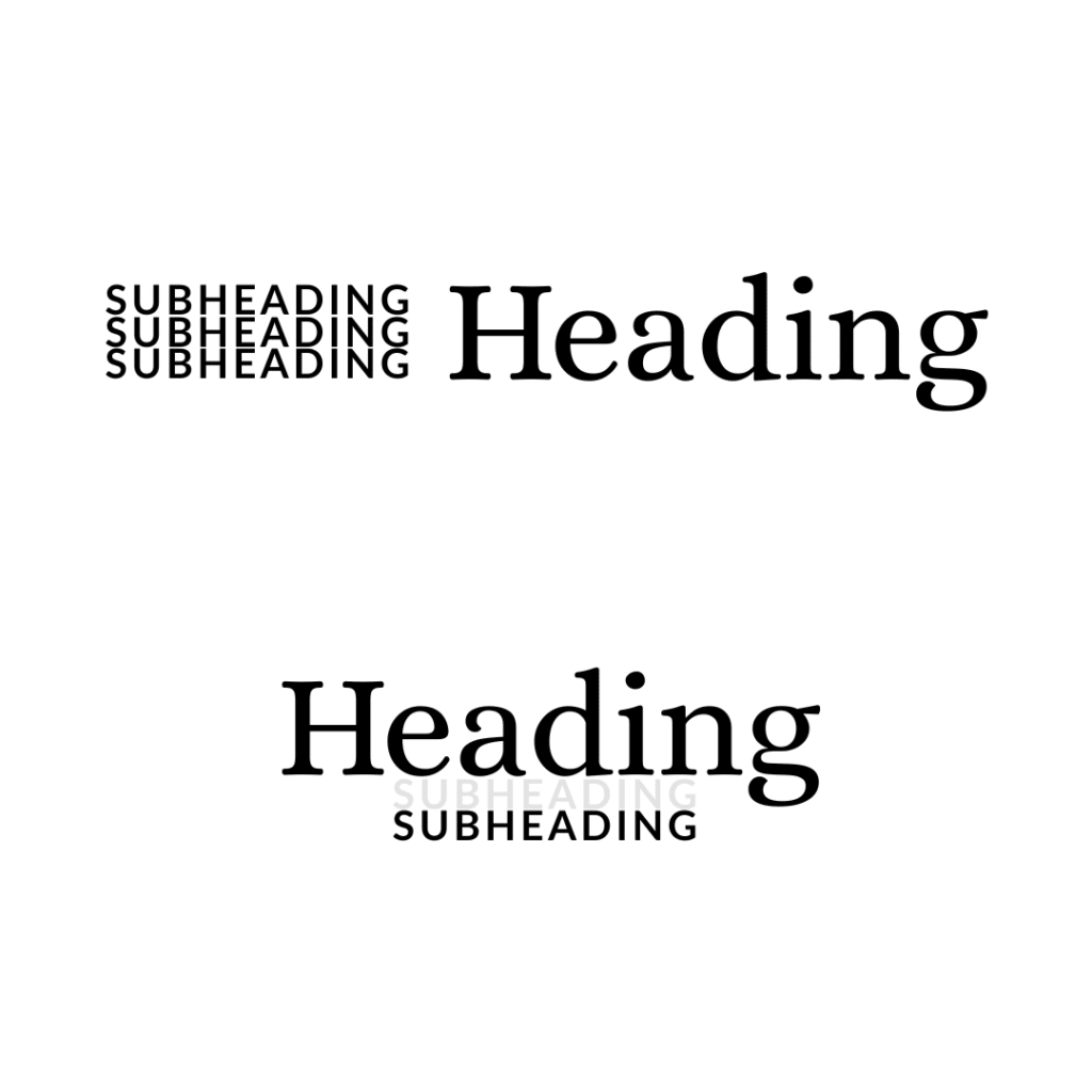
Bam! Perfectly proportioned for the human brain. Don’t ask me why—it has to do with the golden ratio.

https://shorturl.fm/fcOIe