The easiest way to start branding
There’s this thing in marketing called, “The Magic of 7.”
This age-old principle says it takes 7 “touches” with an audience member for you to garner any attention at all.
What does this look like?
- Facebook post
- Paid ad
- Postcard in the mail
- Local bulletin board
- Instagram post
- Facebook Live
Seems like a lot, right?
Nope, this is just the beginning.
It takes all 7 exposures to get someone to say, “Oh, that thing. I think I saw that somewhere else.”
If people can’t recognize your “brand,” every exposure will be the first. No traction.
“How can I make my organization more recognizable?”
The simplest way to contribute to brand recognition is through color. This is a change you can make today.
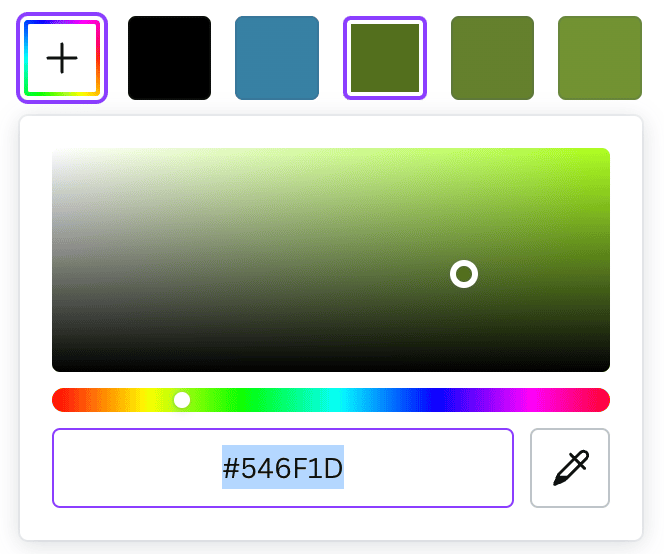
Step 1: Upload an image of your logo at the link above.
Step 2: Drag the little color droppers around the picture to extract the colors in your logo.
- Click the little “+” icon to add more colors. 5-7 colors is the sweet spot.
- Pick a primary brand color. Choose a light, medium, and dark version of this color.
- Pick one “wildcard” color. This will be useful when you want something to stand out.
Step 3: Export the palette as a PDF. Print it, email it to your associate or assistant, add it to your staff handbook, memorize it. (Or not) 😜
Step 4: Whenever you create a graphic for your organization, go back to these colors (and these colors only).
These colors are formatted using Hexadecimal (hex) codes.
If you work in Canva, it looks like this (see the little hashtag?):
If you work in Office, it looks like this.
Not too painful, right? You can totally do this! In fact, having these colors set in stone will actually make your job easier.
If you want a shareable template, you can read my newsletter on creating a Brand Guide.
In the next 2 newsletters, we’ll cover more easy ways to improve your brand recognition.
