Font size guideline cheat sheet
It took me far too long to learn this:
Sometimes when we look at a web page, we can tell that something is off, but we can’t put our finger on exactly what.
This could be a host of things, but most often it’s a problem with the sizes of your text. Either the wrong proportions, too many font sizes, and/or not enough negative space.
Today I’ll teach you a quick fix that will make your website pages or long-form text look just right.
Here’s what I mean. Picture these as sections on your website:
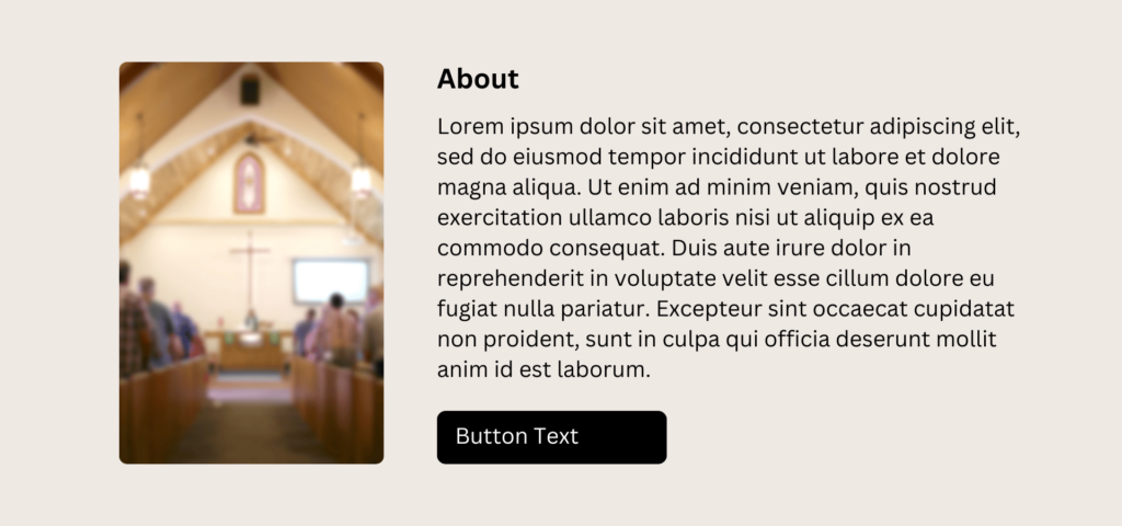
When designing, we can feel tempted to fill up every bit of space…
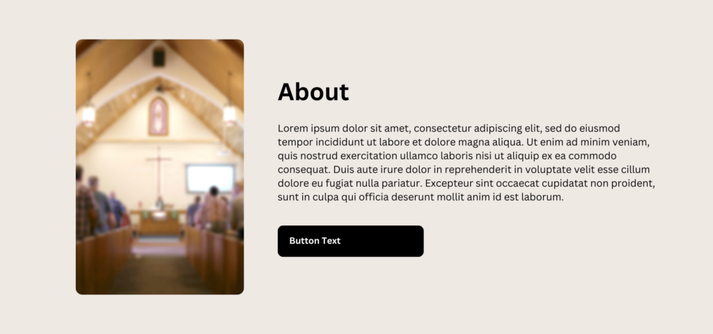
…but designs often look better when you use negative space effectively.
I won’t tell you how to feel—design is subjective—but, I think the second one has a professionalism to it that’s missing in the first one. It’s also more technically correct from a readability standpoint.
All I did was bump up the proportions between the heading and body, make the button text slightly smaller than the body, and gave the whole thing a bit of additional breathing room.
Here’s how to pick font sizes that will give your designs that modern, polished look (plus improved readability!):
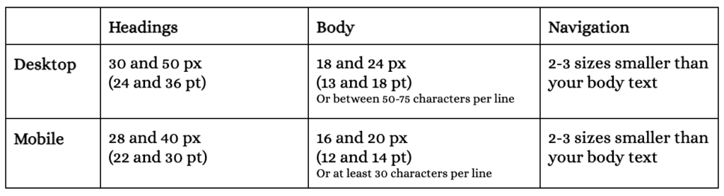
🖥️ DESKTOP (COMPUTER SCREENS)
First, pick your body font and stick with it. This is your default.
It should be between 18 and 24 px (or 13 and 18 pt).
If you’re having trouble choosing, remember that, for text-heavy pages, a chunk of text should have between 50-75 characters per line.
Next, pick your heading font size.
It should be between 30 and 50 px (or 24 and 36 pt).
If you think it’s big enough, bump the size up just a bit more. This is what will give your page that extra boldness and polish. More importantly, it will help your reader skim for the information they need.
Finally, pick a navigation font size to use on buttons, menus, captions, etc.
It should be 2-3 sizes smaller than your default (body) size.
🛑 STOP: Write down these three font sizes and do not deviate from them!
☎️ MOBILE (PHONE SCREENS)
First, pick your body font and stick with it. This is your default.
It should be between 16 and 20 px (or 12 and 14 pt).
If you’re having trouble choosing, remember that a section of text should have at least 30 characters per line.
Next, pick your heading font size.
It should be as large as the screen will allow: between 28 and 40 px (or 22 and 30 pt). Look at it on a real device 📱 and determine what makes the most sense.
Finally, pick a navigation font size to use on buttons, menus, captions, etc.
It should be 2-3 sizes smaller than your default (body) size.
🛑 STOP: Write down these three font sizes and do not deviate from them!
That’s a lot of words. 😵💫
How about I just do this instead?
Here’s a printable version with a blank table so you can record your own font size selections!
