Logo Makeover: St. Mark Ministries | Green Bay & De Pere
A while back I posted in the WELS Intersections Facebook group offering to critique/improve a logo. I had a lot of interest, so THANK YOU if you submitted yours. If this newsletter gets a positive response, I hope to do more in the coming months.
Our subject today is the logo for St. Mark Ministries in De Pere & Green Bay, Wisconsin.
If anyone from St. Mark is reading this, you won’t hurt my feelings if you dislike what I come up with. 😉 I thank you for allowing me to do this!
Here’s what they currently use:
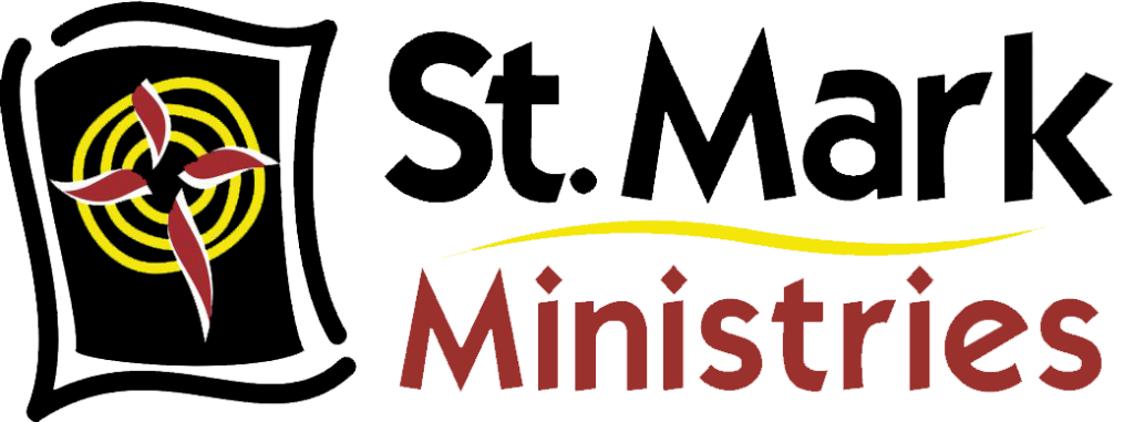
Some thoughts off the bat:
- I believe their currently icon represents a map—”X marks the spot”—with the X being represented by the cross. I could be wrong, but that’s my initial interpretation. Perhaps it’s a Bible? Ripples in a lake? I chose not to ask for clarification because it’s important that I go off of my raw first impression—since that’s likely the first impression of others as well.
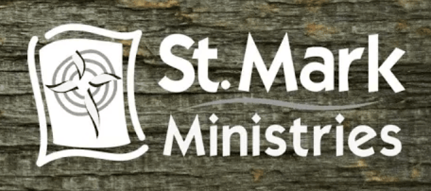
- This logo would be fairly difficult to print in an all-white or all-black version. Here’s an example where you can see the cross is almost lost because of how the logo is built. Technically, even this iteration includes gray.
- They have a collection of other icons they use for youth & family ministry. Browse them here. Overall, they have a pretty clean, modern feel—quite different from their primary logo.
- I feel this typeface is a bit too quirky. They do use this logo for both their church and school, so I want to find something versatile but a bit more serious.
My ideas (see my Pinterest inspo board here 💡):
- St. Mark is physically located on two campuses. They also promote their online campus. Because of this, I don’t want the logo to be too De Pere or Green Bay-centric. I’m going to steer away from using local landmarks or symbols.
- So, if I’m not using a local symbol, what else could I incorporate into the logo that would make it uniquely “St. Mark”?
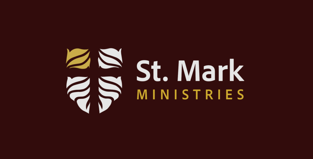
- St. Mark himself is often represented by the Lion in scripture and tradition. This also happens to be the school’s mascot. Bingo! We can work with that.
- It would be cool to create something that could very easily be adopted or just slightly tweaked for the school’s athletic program. Maybe something that could fit into a shield or crest-like shape.
- In their welcome video, the lead pastor underscores that it doesn’t matter where you are on your walk with Jesus—you’re welcome at St. Mark if you’re at the one-day or 70-year mile-marker. If we use the lion, I don’t want it to scare people away or feel too “insider baseball.” It has to be subtle. I don’t want newbies thinking, “Why is that church’s logo a lion?” Perhaps a lion’s mane pattern?
The result:
I dropped the saturation on their existing colors and brought in a few neutrals and a charcoal gray (instead of black). The result is a more sophisticated, mature, regal palette.

I found a more polished, modern font (Adobe Clean Bold) and paired it with an all-caps subhead font (Adobe Clean UX Bold):
Put it all together:
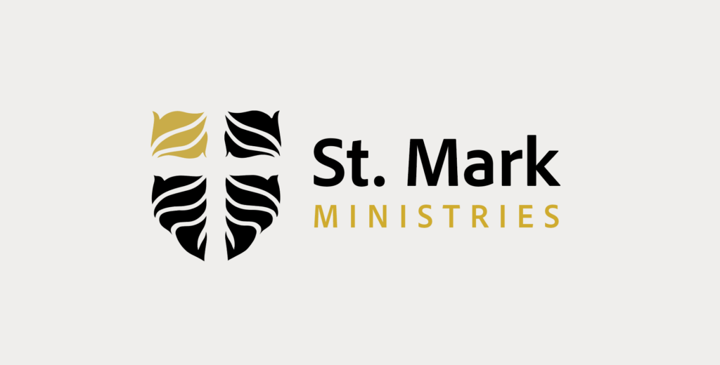
Do you think I accomplished my goals?
If I gave this a bit more time, I would build it out with multiple iterations on this primary logo, a cool brand pattern, and maybe some sub-icons to represent their values or ministries. Perhaps I’d create a more saturated version for the school with a more literal lion illustration. Perhaps I’d make a neat animation for them to use at the beginning of their YouTube videos.
