3 easy ways to make your canva designs look better
November 15, 2024
I love Canva and I feel no shame about that fact.
The professional graphic design community loves to make fun of Canva users. I, on the other hand, think Canva is a great tool: an accessible alternative to expensive softwares. If everyone could be a pro at Adobe Illustrator, that would be great! But that’s just not reality.
As someone who is fairly comfortable with both ends of the software spectrum, I want to teach you a few ways to level up your Canva usage.
1) Instead of the “Lift” text effect, use the “Shadow” text effect.
The lift effect automatically applies a black-based shadow behind text. This can be really harsh (and it’s a dead giveaway you’re using Canva). Instead, use the shadow effect, select a color that’s slightly darker than the background, and set the blur to 100.
Here’s the difference:

With “Lift” (harsh black)

With “Shadow” (soft dark blue): The text still pops away from the background, but in a more subtle way.
2) Eliminate elements and use simpler fonts.
Canva can go a bit overboard with their template designs.
Try leaning into typography instead of clip art. Although it’s counterintuitive, you’ll find that your flyers will stand out if you subtract, rather than add, elements.
Here’s an example:

Canva template as-is

Emphasis on typography and alignment
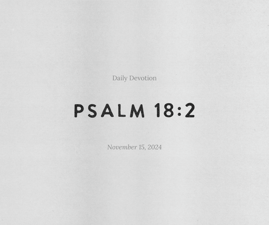
3) Add a texture or overlay.
Search “transparent texture” in the elements section. Play with different options and tweak their transparency.
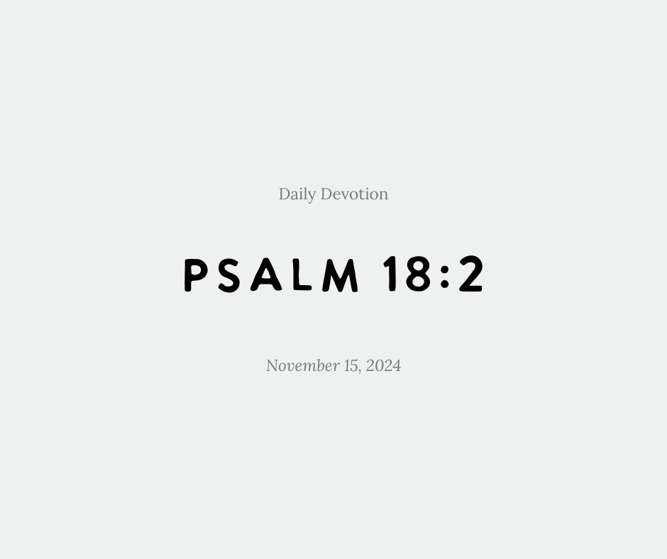
Here’s a sample Instagram post:

Without texture

With texture
If you have a little budget to play with, you can check out Creative Market and search “transparent overlay” or “texture.” Any PNG file can be purchased and imported into Canva to use again and again.