The most crucial pixels on your website
We’ll start with some vocabulary you need to know:
“Above the fold”: The section of your site your viewers can see right away without scrolling.
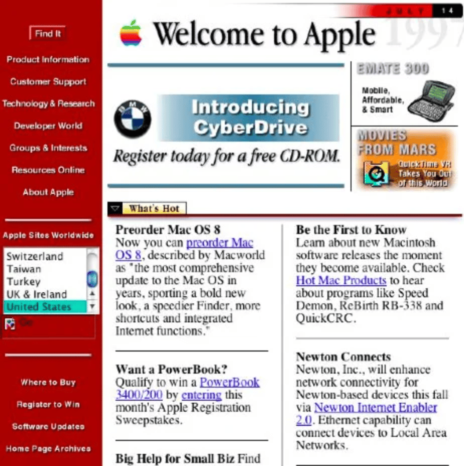
In the past, best practices told web designers to have every important piece of information above the fold.
That’s how we achieved the stunning creation (sarcasm) that is Apple’s original homepage:
In 2024, best practices indicate that we no longer have to do this. Why? Because modern devices make scrolling a lot easier than it used to be.
So – what’s the new goal for content that’s displayed above the fold?
Let’s unpack the answer. Our goal is to capture attention and promote engagement. The best way to do this is with one focused message that’s tailored to your target audience’s needs.
Essentially – we want to either encourage people to scroll OR click.
Here’s what I’d like to see:
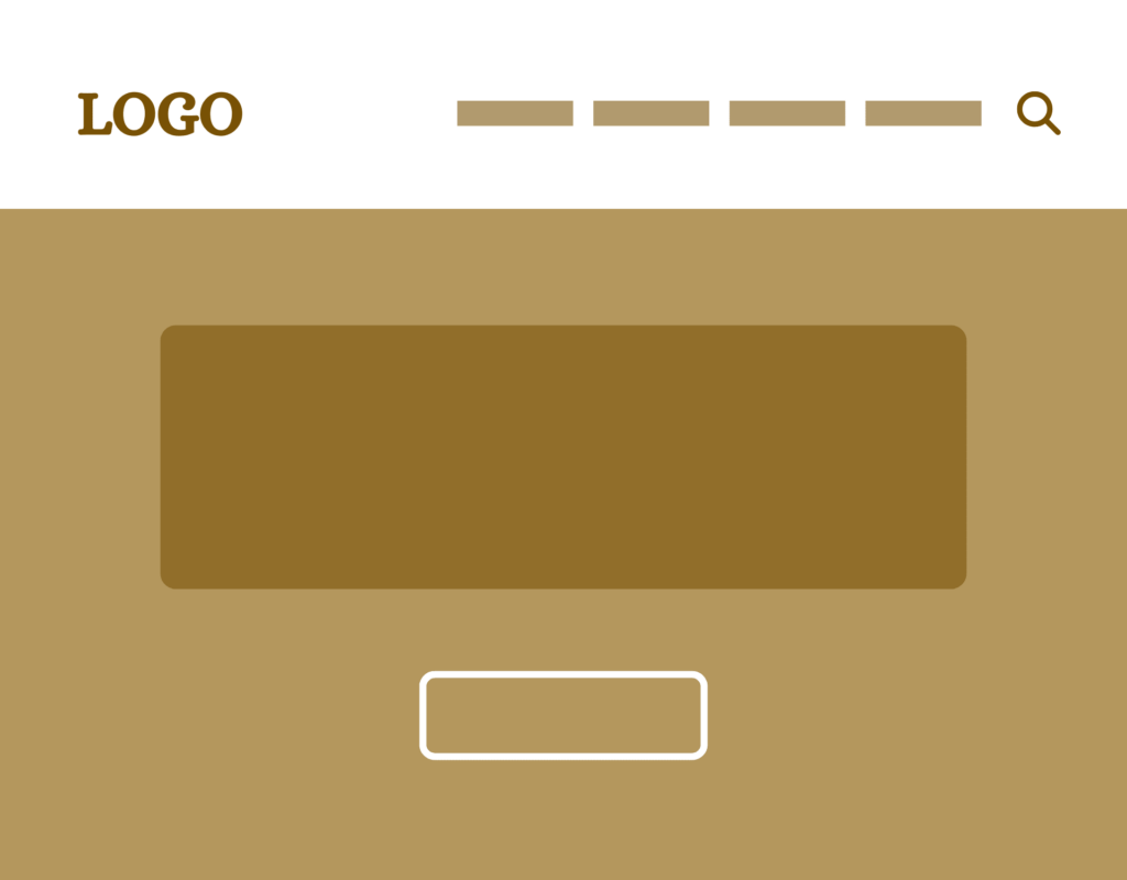
Notice the navigation bar across the top. Then, the brown rectangle should contain some text – called your banner text. The white button beneath it should have one very strong call-to-action.
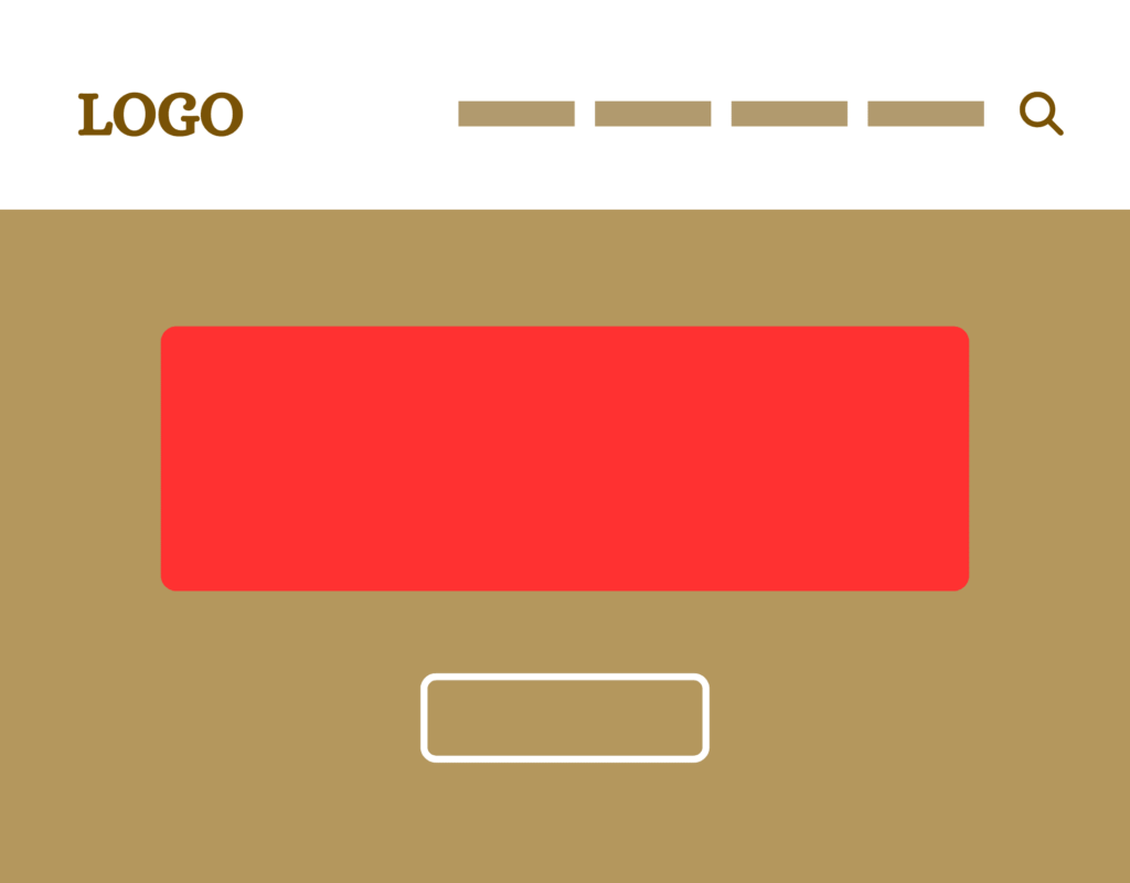
The banner text (location in red above) across the header of your site should be concise, engaging, and directly connected to the desires and needs of your target audience. This is the first thing visitors see, so it needs to make a strong impression. Think of using a shortened version of your mission statement…
Good example: Bringing hope to Indianapolis
Bad example: Welcome to Christ Lutheran Church
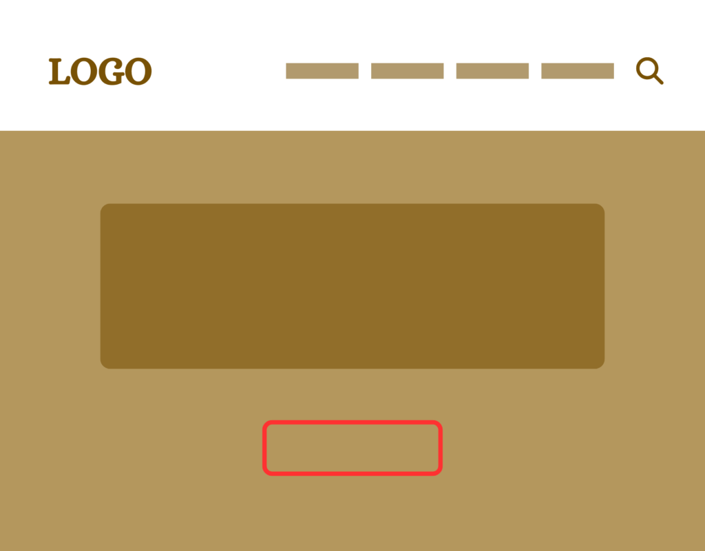
The primary call to action button (location in red above) should be compelling, evoke a little curiosity, and stand out visually from the rest of the page. It should prompt the visitor to take a specific action that aligns with your goals.
Good example: Take a 60-second school tour
Bad example: Learn more
