Does your color palette pass this test?
Let’s use your logo to make a functional color palette.
Pastor John Qualmann in Crossville, TN gave me permission to use his logo as an example. Thank you!

If Pastor Qualmann only used the colors in his logo to create graphics, those graphics wouldn’t pass the contrast test.
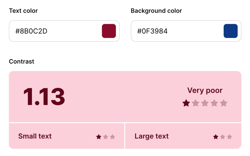
Why does contrast matter? Besides making things hard on the eyes, poor contrast can negatively impact your compliance with the Web Content Accessibility Guidelines.
So what? Well, websites deemed “inaccessible” do not index in Google Search.
Crazy, right? Your color palette can directly affect your Google Search rankings. 😲
Let’s make sure you have enough colors in your tool belt to stay compliant and make beautiful graphic designs.
Follow along with my Canva template
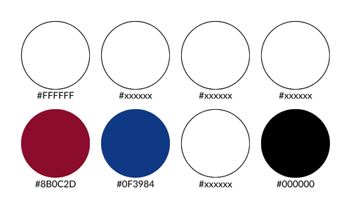
Step 1: Start with 8 color slots. Place your logo colors into the template.
Use this color-dropper tool if you don’t already know your colors.

Step 2: Add a true black (Hex: #000000) and true white (Hex: #ffffff).
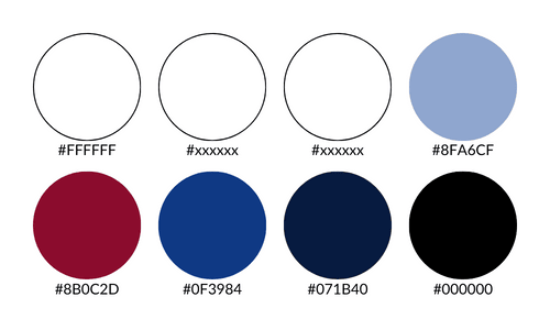
Step 3: Pick one color to be your POP color. Pick one color to be your MAIN color.
Our POP will be red.
Our MAIN will be blue.
Choose 1) a light shade and 2) a dark shade of your MAIN color.
Step 4: Pick a neutral color for your last two slots. Pastor Qualmann’s website uses a nice beige, so I matched that.
I worked for another church that had a nice slate blue/gray as their sanctuary’s interior paint color – so I used that. Get creative!
Select 1) a super light shade and 2) a medium shade of this color.
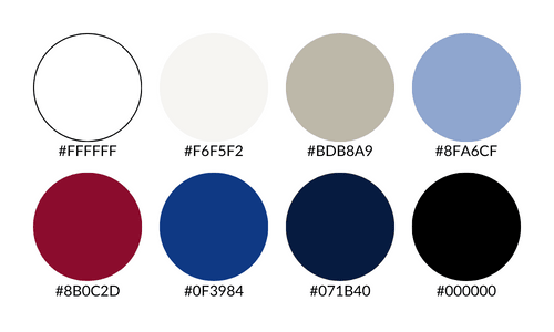
We did it! Now we have a beautiful, functional, compliant color palette to use in our graphics and on our website.
